
Creative Direction, Brand Identity, Logo Design
Content Repurposing Roadmap
Brand Strategy
Problem:
Content Repurposing Roadmap targets marketers who struggle with distributing their valuable content effectively. The challenge was to create a brand identity that resonated with this audience and clearly communicated the essence of the course—helping marketers reuse, recycle, and repurpose their content for maximum impact.
Solution:
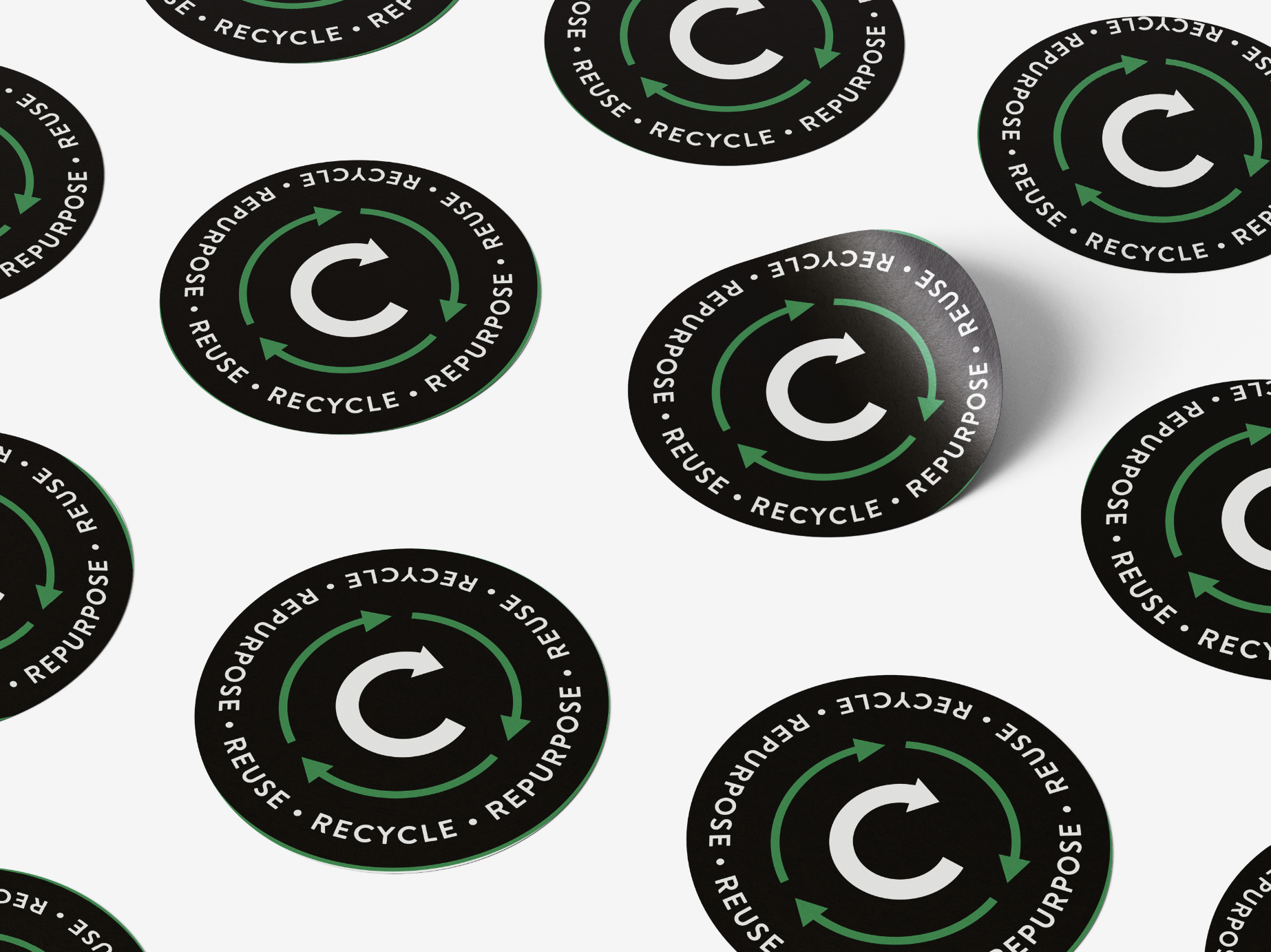
I focused on the course's three key pillars—Reuse, Recycle, and Repurpose—as the foundation of the brand strategy. The visual identity, centered around a fresh green color symbolizing growth and sustainability, was applied across all digital and physical assets, from the website to social media and merchandise. The logo, featuring a stylized "C" with revolving arrows, reinforced the core message of content repurposing.


Logo
The logo features a stylized "C" with three revolving arrows, representing these pillars. The revolving arrows also symbolize the idea of reusing and repurposing content, instead of constantly creating new content.


Visual Identity
To create a consistent and recognizable look for Content Repurposing Roadmap, I developed a visual identity that extended beyond the logo.
I chose a fresh and vibrant green color as the primary color for the brand, as it represents growth, renewal, and sustainability - all values that are central to the course.
For typography, we chose a modern sans-serif font that was easy to read and reflected the course's modern and forward-thinking approach. I also used bold typography to highlight key messages and calls to action, making them stand out to potential customers.


Results:
The cohesive and consistent visual identity built trust and credibility with the target audience, clearly conveying the course's purpose. This brand strategy helped the course stand out in a crowded market, appealing to marketers looking for a modern, effective way to amplify their content.
Conclusion:
By aligning the brand identity with the core message of Content Repurposing Roadmap, we were able to effectively communicate the value of the course and create a strong connection with the target audience.
